Lusiné VartanLV
Brand & Website Case Study · Stagecoach · Washington, DC · 2026

Stagecoach

Emergency care that comes to you.

A doctor-led emergency medicine practice in Washington, DC, preparing to open. I built the brand, wrote and built the website, and produced the print and apparel files the team needs to launch.

Pre-launch. The practice is awaiting EMS Agency approval from the District of Columbia, so the site runs a waitlist until then.

The work ↓

At a Glance
The situation
A new practice with a name and a team of physicians and medics, and no mark, website or materials.
My role
Brand identity, copy, website design and front-end build, motion, print and apparel artwork, handoff.
The work
One mark, a nine-page website, a 221-file brand kit and a 22-page brand booklet.
What changed
The team has a site ready to publish, a way to edit it without a developer, and vendor-ready files for cards, shirts and bags.
In Motion

The site draws its own logo as you scroll.

A 25-second cut of the work: the mark, the phone sequence where the call becomes a ring and the ring becomes the S, the colourways, the tote and the brand book.

Silent · plays when in view

The Brief

Doctors who come to you when it is too urgent to wait and not bad enough for 911.

Stagecoach sends physicians and medics to homes, offices and events in Washington, DC. The founders had the team, the vehicles and the clinical model. They needed everything a member or a partner would see.

Two rules shaped all of it. Nothing on the site may read as a substitute for 911, so that line sits in every footer. And no statistic goes on a page unless the practice can source it, so there are none.

Role
Brand, copy, UX, front-end, motion, print
Year
2026
Client
Stagecoach Concierge Emergency Medical Services
Status
Pre-launch, waitlist open
The Mark

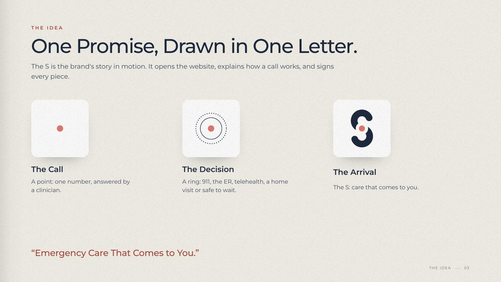
One S, drawn as two arcs around a dot.

The same shape is the logo, the opening of the website, the step tracker in How It Works, and the embossing on the kit bag.

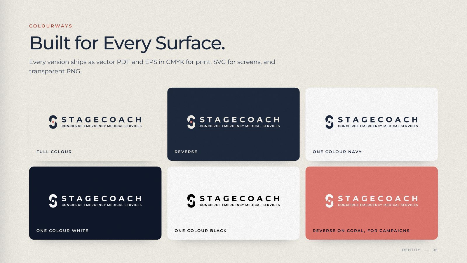
Four layouts: horizontal, stacked, symbol and wordmark. Five colourways. Every file is outlined artwork in PDF and EPS for print, SVG for screens and transparent PNG at three sizes, so no vendor needs the fonts.

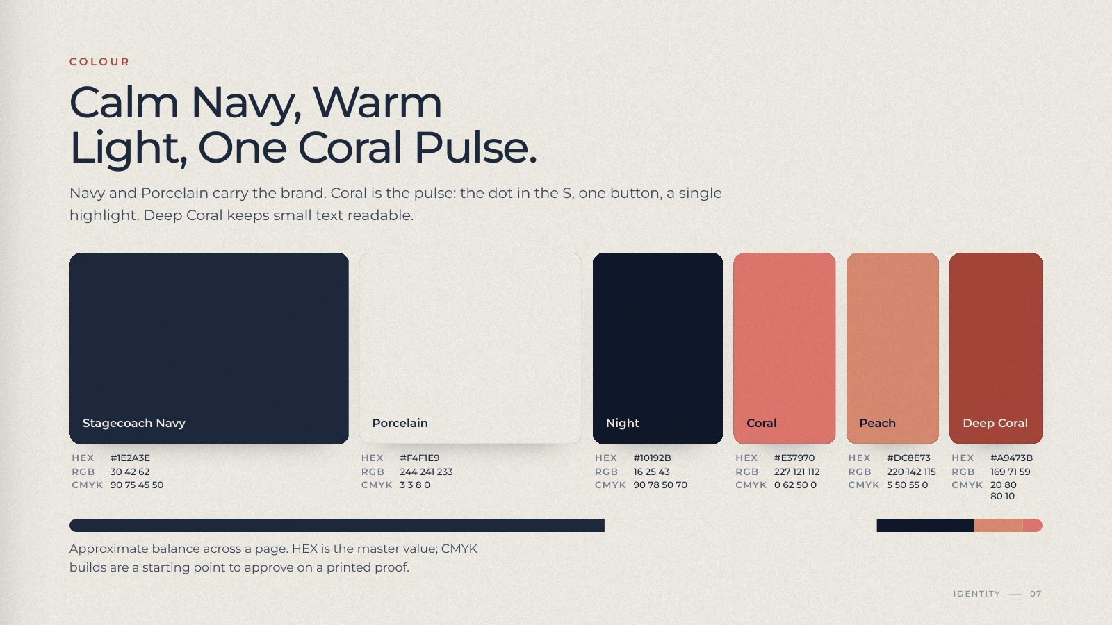
Navy and porcelain carry the identity. Coral appears once per surface: the dot in the S, the one button on a page, a single stitch on the cap.
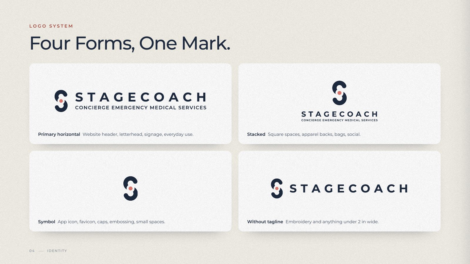
Logo system: horizontal, stacked, symbol and wordmark lockups
Logo system
Six colourways of the horizontal lockup on cream, navy, white and coral
Colourways
Clear space, minimum sizes and six examples of what not to do with the logo
Usage rules
Palette: Stagecoach Navy, Porcelain, Night, Coral, Peach, Deep Coral with hex, RGB and CMYK values
Colour
The Website

Nine pages, written in plain English.

Home, Services, Membership, Kids, Events, Team, Careers, Partners, Contact, and a 404. Built as static pages with one stylesheet and one script.

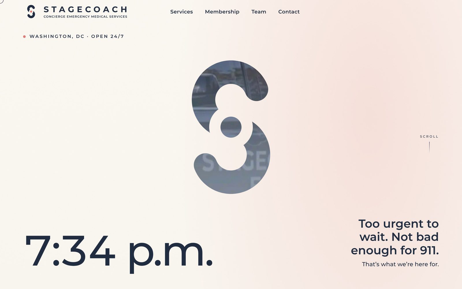
The S opens the site once per visit as a mask over the team's own footage, then settles into the header. How It Works is a step tracker tied to scroll: call, decide, we come. Coral is reserved for one action, Join the Waitlist.

Checked at 23 viewport sizes for overflow and overlap. Automated accessibility scan with axe-core returned zero violations; keyboard, focus and contrast checked by hand. Every page, link and image verified loading.

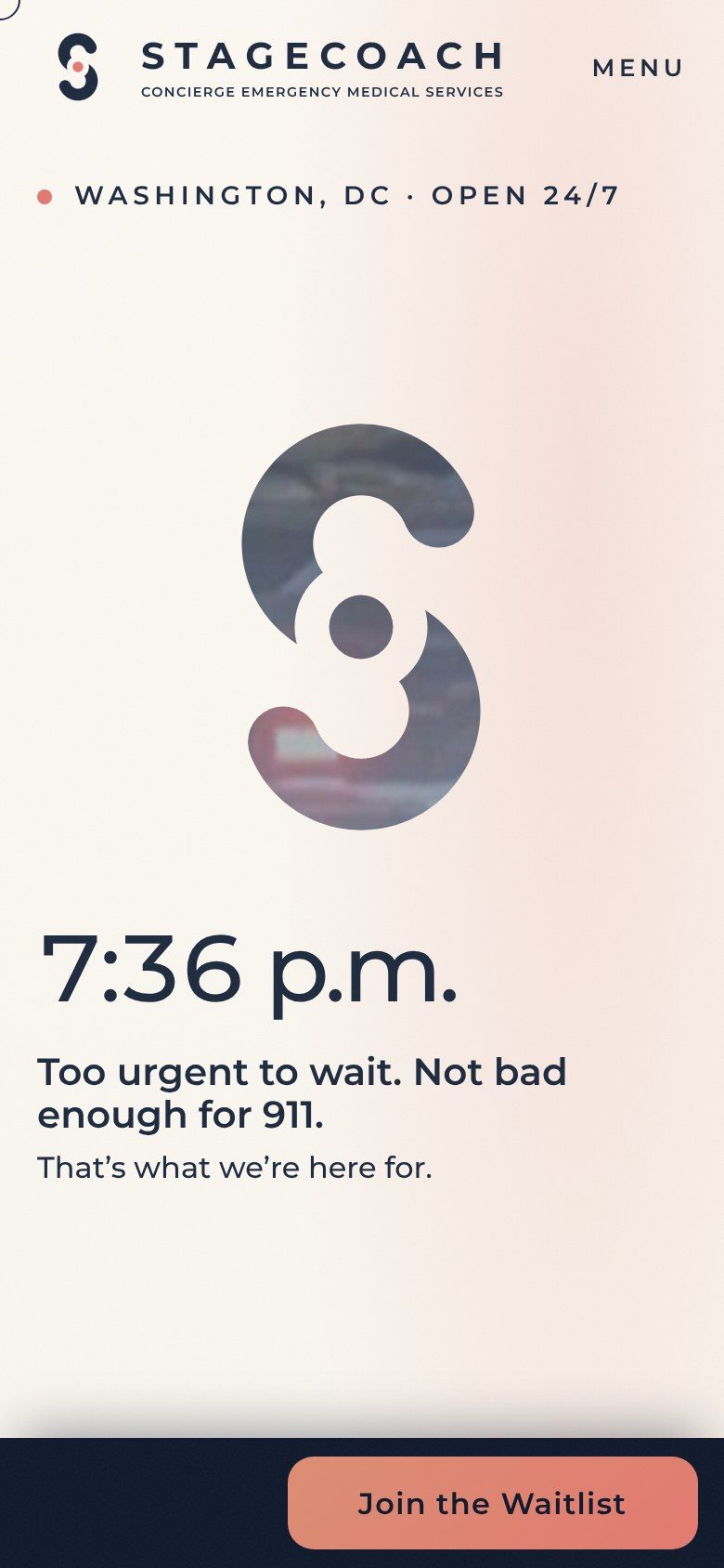
Opening scene: the S cut out of a cream page, revealing the response vehicle behind it, beside the line Too urgent to wait. Not bad enough for 911.
Opening scene
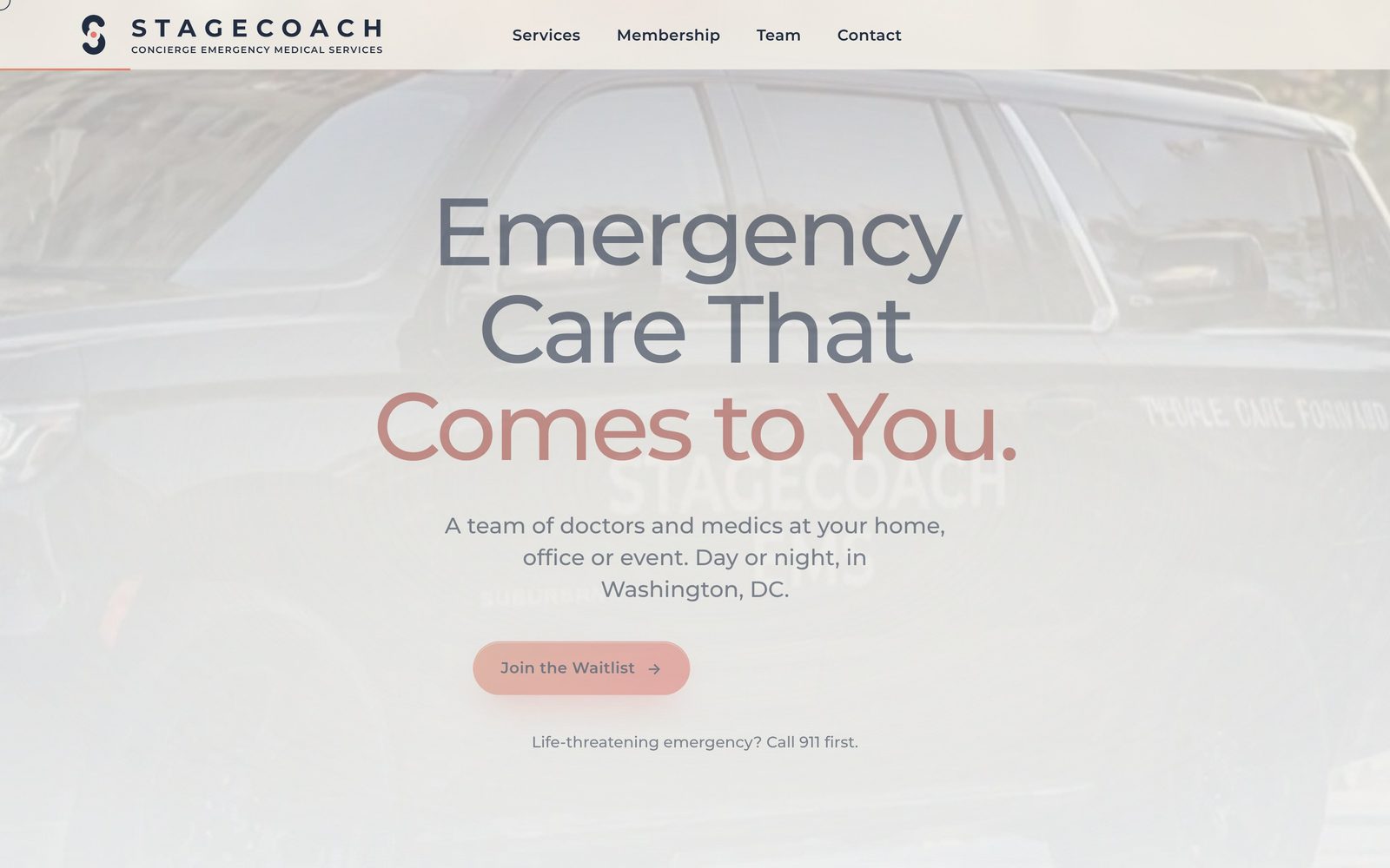
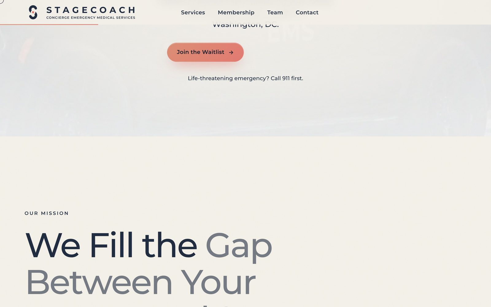
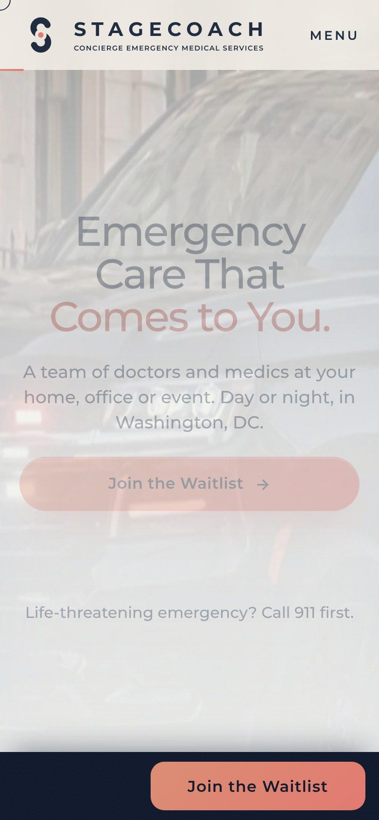
Headline scene: Emergency Care That Comes to You over the vehicle, with Join the Waitlist
Headline
How It Works step tracker and the services row
How It Works
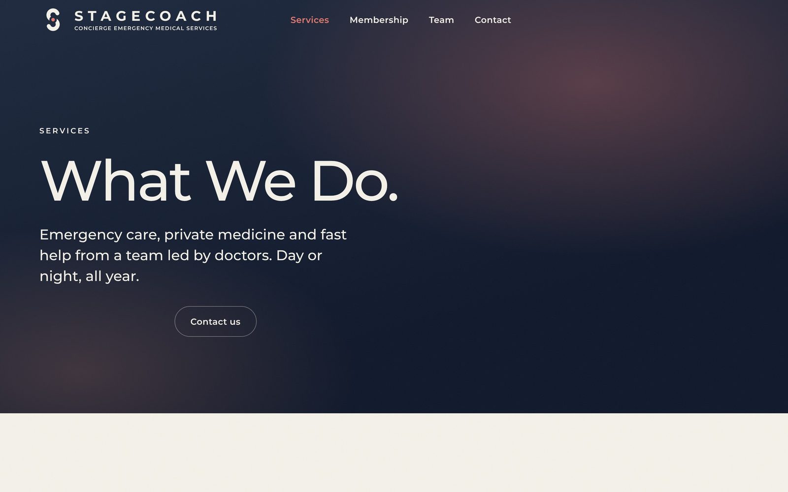
Services page
Services
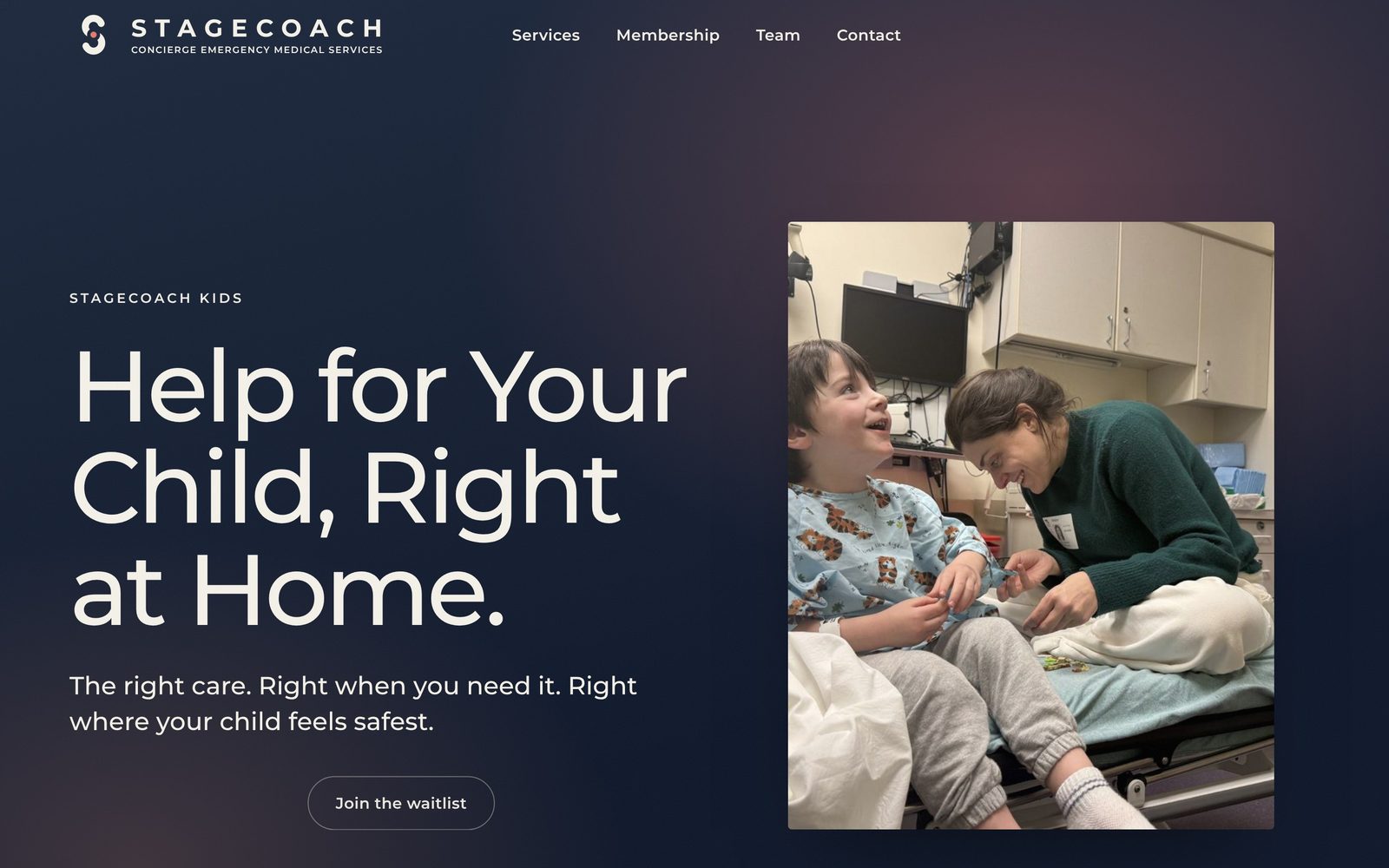
Stagecoach Kids page
Kids
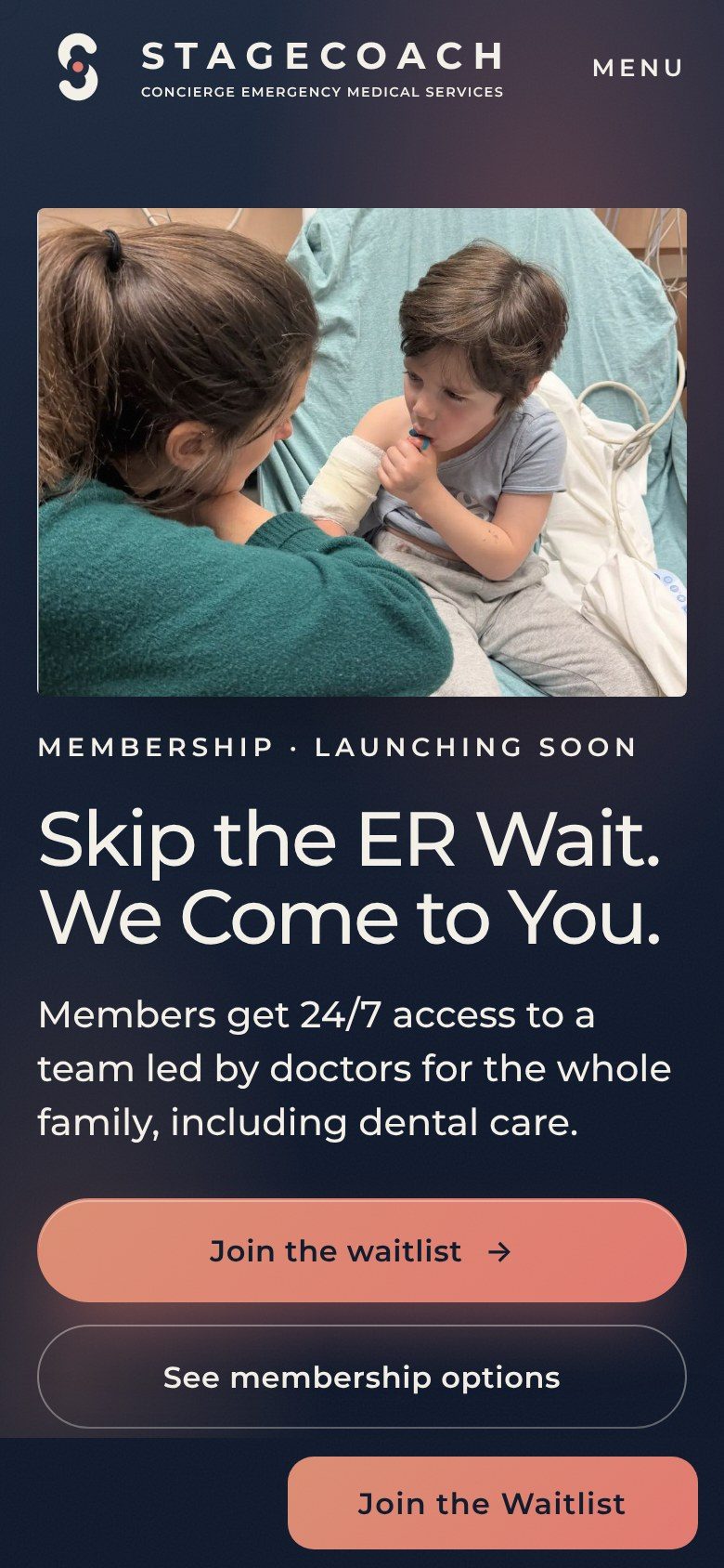
Home page on a phone
Phone, home
How It Works on a phone
Phone, How It Works
Waitlist on a phone
Phone, waitlist
Print & Apparel

Print and apparel files, ready for a vendor.

Business cards for ten team members, CMYK with bleed. Tees, quarter-zip and cap with embroidery specs. Shopping bag, tote and a leather kit bag. Letterhead and an email signature.

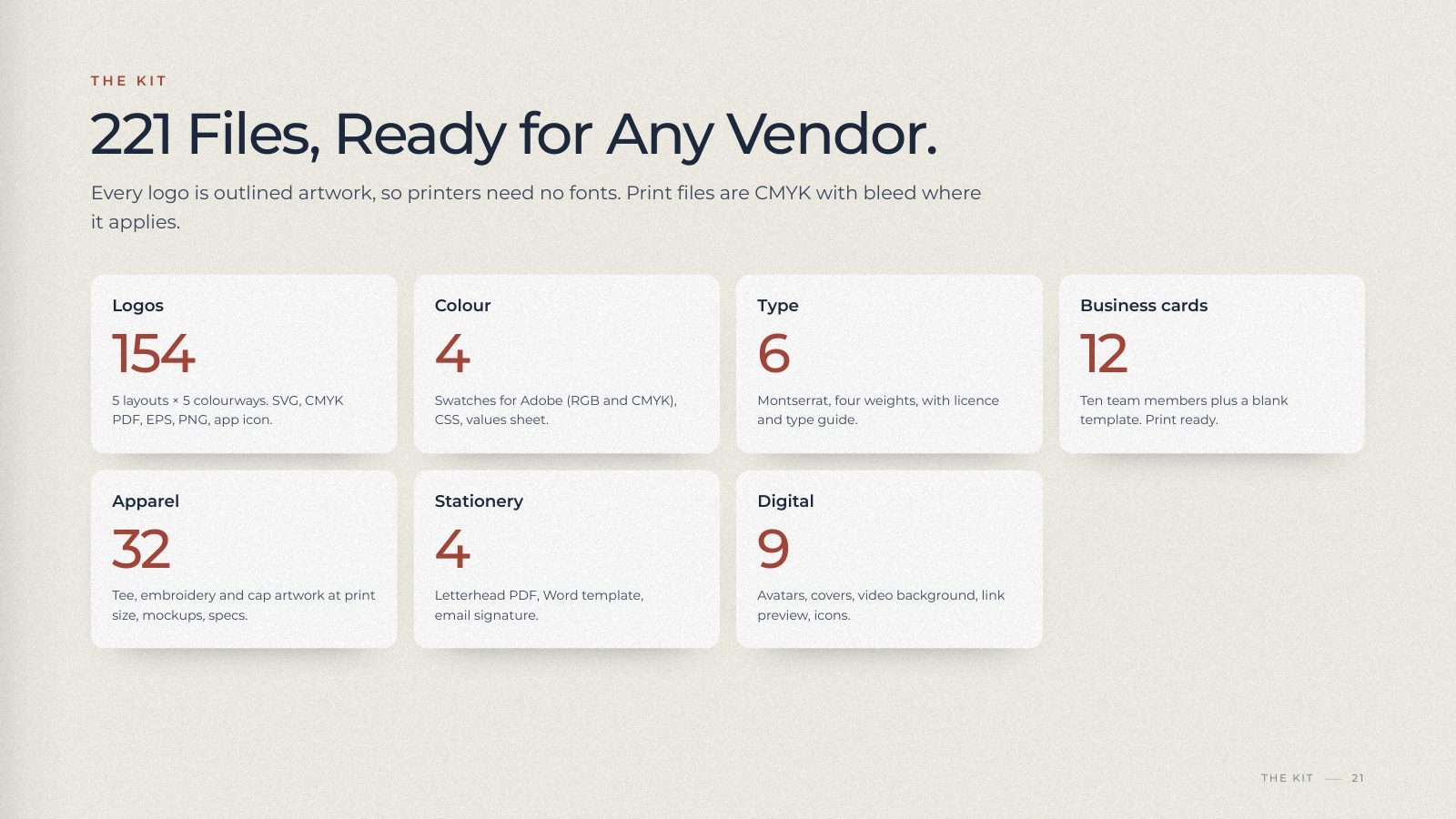
The kit is 221 files in seven folders with a start-here note, and a 22-page booklet that shows each piece in use so the team can brief a vendor directly.

Kit inventory: 154 logo files, 4 colour files, 6 type files, 12 card files, 32 apparel files, 4 stationery files, 9 digital files
The kit
Handoff

The team edits the site with their own Claude account, without a developer.

The site was imported into the client's Lovable project as plain files. A brief in the repository tells any agent the brand rules, the legal lines and where every file lives; a short guide and a page of ready prompts cover the common changes.

The booklet opens as facing pages with a contents list and bookmarks, so it reads as a book rather than a deck.

Booklet cover: Stagecoach lockup in cream on navy, Brand and Experience Vision
Booklet cover
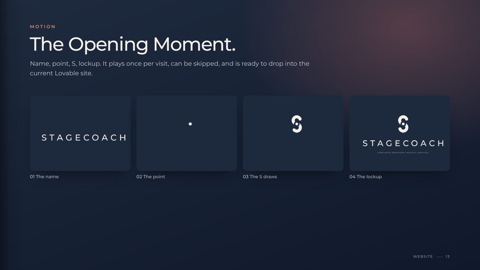
Four frames of the opening animation: name, point, S, lockup
Opening motion, four frames